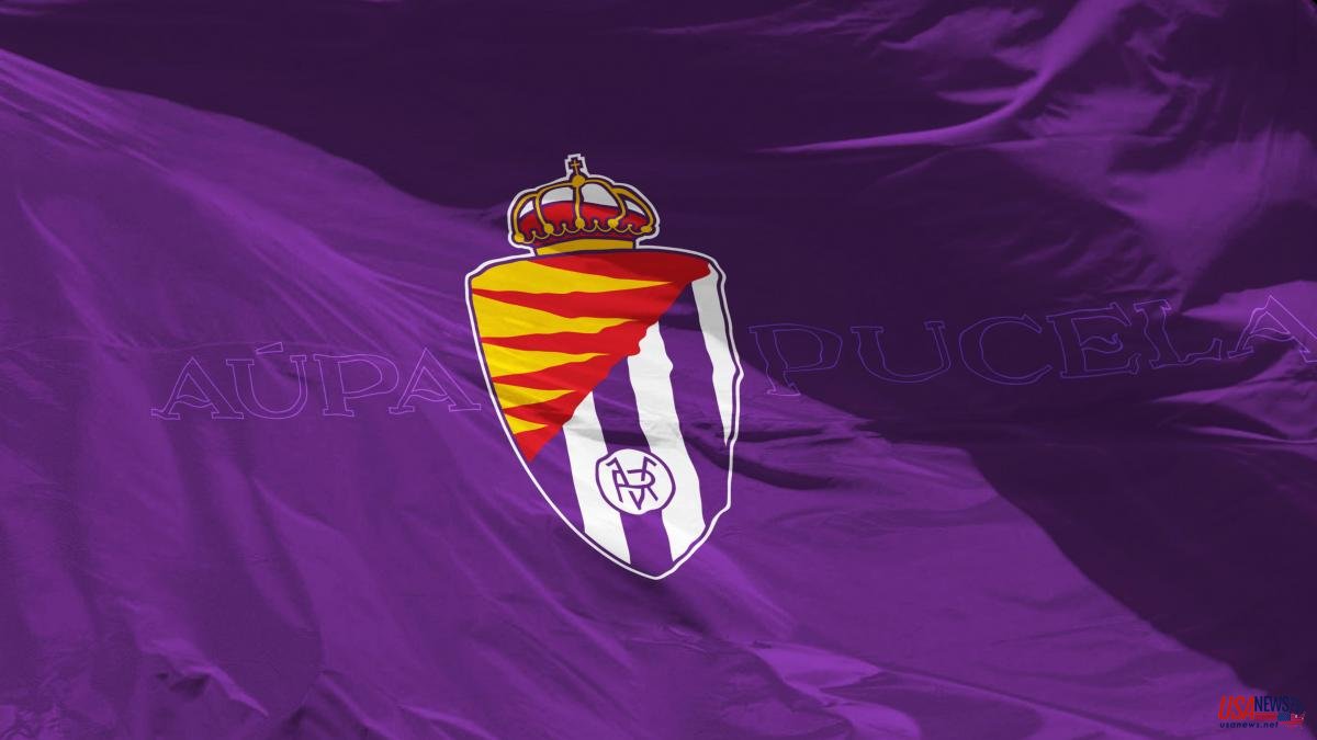
Essence, identification with some colors, historical connection, tradition, respect for the roots, return to the origins. These are some of the arguments that Real Valladolid used to justify its change of shield and image. Greater prominence of violet, legible acronyms, flames that could represent a fire that occurred in 1561 (the origin of the symbol is not clear), a new typeface ("Pucela Font", by the Valladolid typographer Carlos de Miguel) and the elimination of the crown of laurel are the main transformations of the badge of the newly promoted LaLiga Santander.
This last detail was the most controversial of all, since many fans considered it the most identifying element of the club. There are also those who understand it as the elimination of a Francoist remnant, since the laureate was the decoration that the dictator Francisco Franco awarded to the city of Valladolid in 1939 for his role in the Civil War. Changes are often met with rejection and people take time to adjust to them.
Be that as it may, two things are clear: on the one hand, football clubs understand that they need to renew their image to adapt to new stylistic trends and strengthen themselves at a marketing level; and, on the other hand, minimalism is imposed as the mainstream. The reduction of symbolic elements, the simplification of shapes and lines and typographical modernization are the characteristics common to all the new shields that are recently emerging in the world of football. These are some of the main examples of the movement that Valladolid has just joined.


